The Art of Map Making
The Art of Map Making
Although the emphasis in this course and programme is rightly on ensuring the scientific integrity of maps, the artistic component of mapmaking is a key component of science communication and should not be overlooked. Cartography is the art and science of mapmaking. Finding the balance between art and science can be very difficult and will look different for each individual map maker. However, finding this balance is key to creating beautiful maps that people want to look at, but that also effectively communicate your data and your take-home message.
Map making, especially cartography, is an art as we have just discussed. There are so many beautiful maps and amazing ways to display data or information. While here at MGEM, or in any GIS position or work you do, it’s always helpful and inspiring to find maps that tell a story visually. These can either inspire you to make better maps, or maybe even give you ideas about how you might want to visualise data.
Examples of Artistic Maps
There are many beautiful maps out in the world that are more art than science but that doesn’t disqualify them from being called a map. Here are a few examples of what might not traditionally be called maps in a scientific sense, but can be used as either a cool visualization or maybe even some inspiration for your work:
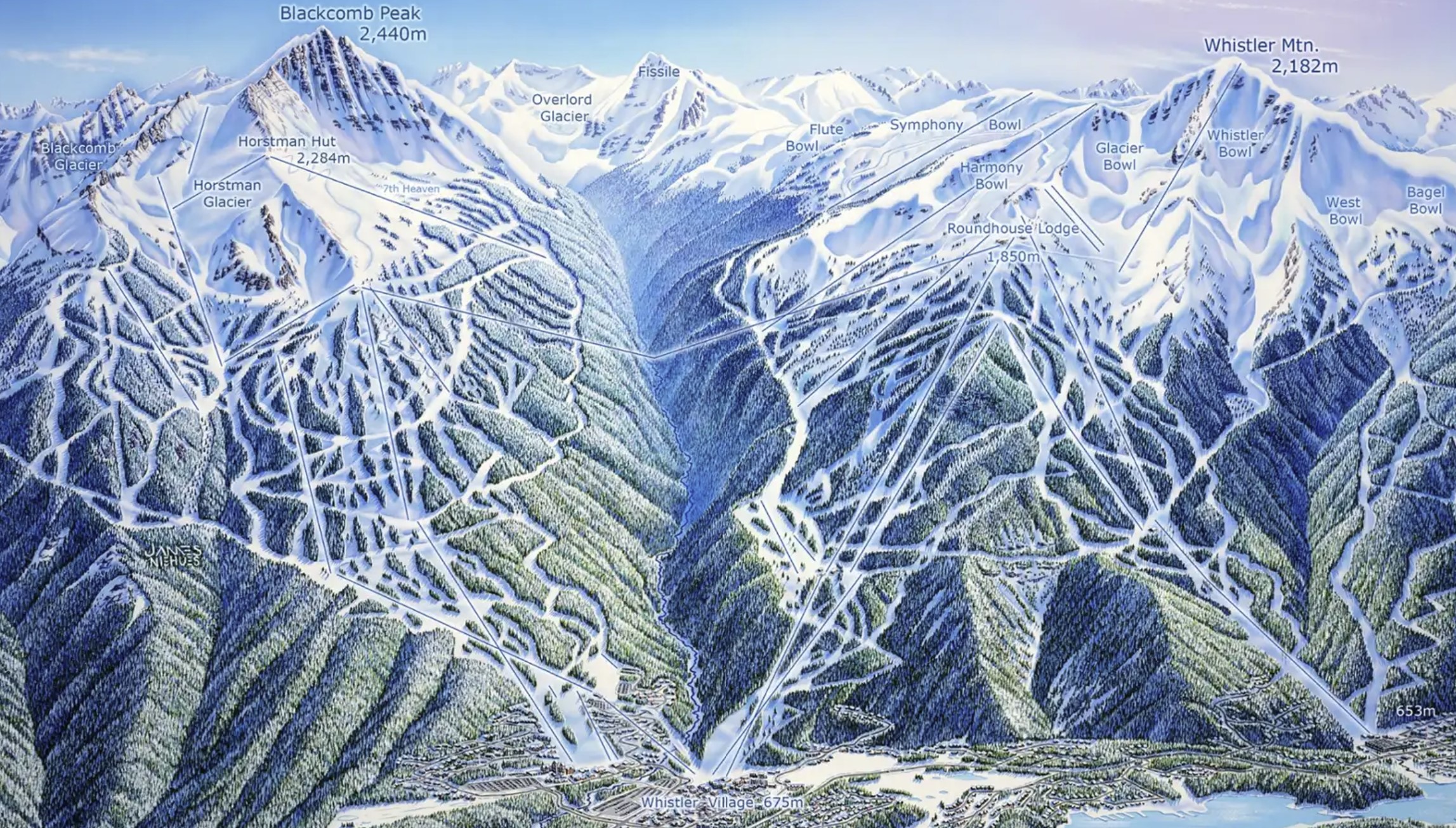
Maps like the one above are a great example that not every map needs to have every single detail shown, like we’ve talked about “all maps are lies”, so sometimes you need to lie a little to better convey a message and visualize your work.
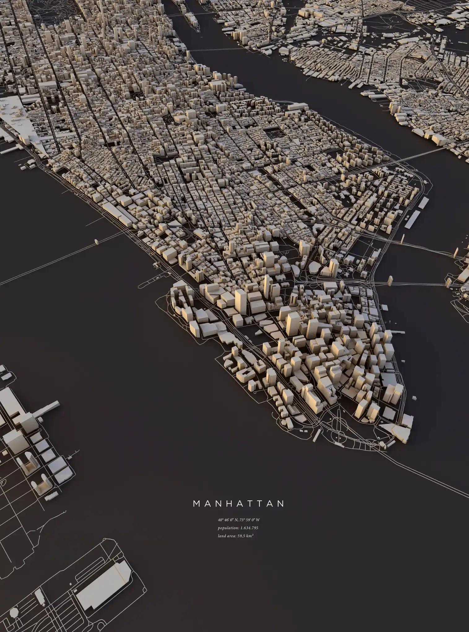
While these shift a little bit from what we talked about in the cartography section of today, hopefully these can serve as a reminder that map making is an art its core, don’t be afraid to put your own style and touch on your maps!
Map Making for Academia
While making pretty and aesthetically pleasing should be one of your top priorities, something to consider even more than that when creating a map is to think of the audience or intended purpose of this map. Most importantly, always pay attention to any requirements for maps in academia or journal you are submitting to. Similarly, if you work in industry or something similar, you will likely be given guidelines on how to make a map or what your potential employer is looking for.
Data
While the data you chose to map and display isn’t something that will or won’t be mandated and controlled, it’s always important think about what data you want to map, and why. For example, a study area map is very common and almost expected for many journals or papers in GIS and remote sensing due to the fact that giving the reader an idea of where the study is can be essential for understanding the context of the work.
As for everything besides a study map, a good rule of thumb on whether to make a map is if there is a spatial element in your data, then its probably a good idea! However, always keep your maps as simple as you can, an overcrowded map is one of the easiest ways to have your reader simply ignore your map or not get the message
When it comes to how much, or which data, to add on your map always keep things as simple as possible and it’s never a bad idea to just make a few maps.
Colour
The colours you chose for you map, like many things in cartography, is up to you but you can definitely get it wrong. For example, when it comes to publication, sometimes you may need to have colours that are colourblind friendly or even can print in black and white. However, those may be laid out for you in plain to read rules, but today I think its best to think of some rules or guidelines that aren’t as obvious. Such as for land classification:
Water is blue
Green for vegetation
Brown for mountains or rough terrain
Sounds simple enough, but easy to stick to ideas like this take just a second to step back and think of which colour you’re choosing and why. What data your representing can also help decide your colour, for example a map showing hotter temperatures in blue might not be trusted as much as one that shows the same in red….
As for choosing a colour ramp that is diverging or sequential depends on your range of data, but resources such as ColourBrewer are an amazing place to go back for inspiration and any help:
Helpful Links and Resources
Tutorial Cartography for Map Figures in Academic Journals & Books